Practical Color Theory
for People Who Code

Pick your call to action color!

Let's get started!

Natalya Shelburne
@natalyathree

What is this & why should I listen to you?

Hi! I'm Natalya! I'm a classically trained fine artist who spent 6 years teaching people how to paint, draw, and grow their creativity. I am now a front end developer, and I love writing code as much as I love painting.

I have a degree in Studio Art, a bachelor's in Developmental Psychology, and a master's degree in Creativity and Talent Development. But, most importantly, I have mixed gallons and gallons of paint.

I abstracted my domain knowledge as a fine artist into variables and functions in order to reveal color selection as being logical, predictable, and driven by principles anyone can learn. Sass color functions give you the same creative power as owning a set of paints, brushes, and canvas.

This is a demo of my functions for a complementary color scheme - pick any color on the color wheel and the functions will make sure that the scheme will still work! 🎨
Let's build a Complementary Color Scheme!

color-wheel

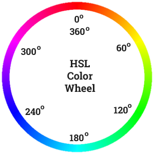
This is the color wheel, consider this the documentation for using color.
Notice that the degrees on the color wheel correspond to colors.

Pick a color hsl($hue, $saturation, $lightness)

Pick any color by selecting its hue (0-360) on the color wheel at full saturation (100%) and at half lightness (50%) - this way you start with the 'most colorful color' you can get.

This is what your website will look like if you set every element to this one color. Notice how you can't tell one item from another. Color is information.

Hello, World

tiny lorem ipsum tiny lorem ipsum tin rem ipsum ?

tiny lorem ipsum tiny lorem ipsum tiny lorem ipsum tiny lorem ipsum tiny lorem ipsum tiny lorem ipsum tiny lorem ipsum tiny lorem ipsum tiny lorem ipsum tiny lorem ipsum tiny lorem ipsum tiny lorem ipsum tiny lorem ipsum tiny lorem ipsum tiny lorem ipsum tiny lorem ipsum tiny lorem ipsum tiny lorem ipsum tiny lorem ipsum tiny lorem ipsum tiny lorem ipsum tiny lorem ipsum tiny lorem ipsum tiny lorem ipsum tiny lorem ipsum tiny lorem ipsum tinyny lorem ipsum

cta

Why pick a fully saturated color, but only half lightness?

Ever mix up a bunch of colors only to end up with a gray blob? In the real world, you can't mix a color to be more saturated - you only "lose" color information as you mix. So, the practice is to start with the most saturated colors at their most chromatic so you can still have a full range of mixing opportunities.

Generate Complementary Colorcomplement( );

Generate your second color without having to guess what will work. Thanks to science and wavelengths, we know that this works. The opposition of these two colors stimulate your photoreceptor cells in a good way!

Finally! A different color - now hue separates elements from each other and a layout can be seen.

Hello, World

tiny lorem ipsum tiny lorem ipsum tin rem ipsum ?

tiny lorem ipsum tiny lorem ipsum tiny lorem ipsum tiny lorem ipsum tiny lorem ipsum tiny lorem ipsum tiny lorem ipsum tiny lorem ipsum tiny lorem ipsum tiny lorem ipsum tiny lorem ipsum tiny lorem ipsum tiny lorem ipsum tiny lorem ipsum tiny lorem ipsum tiny lorem ipsum tiny lorem ipsum tiny lorem ipsum tiny lorem ipsum tiny lorem ipsum tiny lorem ipsum tiny lorem ipsum tiny lorem ipsum tiny lorem ipsum tiny lorem ipsum tiny lorem ipsum tinyny lorem ipsum

cta

The complement to any color is always 180 degrees across on the other side of the color wheel. If you've ever wondered why it's the color wheel instead of a color line, this is part of that answer. Remember that the color wheel is our visual documentation for color relationships.
Fun fact, if you mix complementary colors, they'll cancel each other out and you'll end up with a neutral gray.

Color Relationship Established by Mixingharmonious-mix( );

Establish a color relationship by mixing them together. This makes the colors look like they're under similar lighting conditions.

Here, you see less saturated hues, with a clear relationship between each other.

Hello, World

tiny lorem ipsum tiny lorem ipsum tin rem ipsum ?

tiny lorem ipsum tiny lorem ipsum tiny lorem ipsum tiny lorem ipsum tiny lorem ipsum tiny lorem ipsum tiny lorem ipsum tiny lorem ipsum tiny lorem ipsum tiny lorem ipsum tiny lorem ipsum tiny lorem ipsum tiny lorem ipsum tiny lorem ipsum tiny lorem ipsum tiny lorem ipsum tiny lorem ipsum tiny lorem ipsum tiny lorem ipsum tiny lorem ipsum tiny lorem ipsum tiny lorem ipsum tiny lorem ipsum tiny lorem ipsum tiny lorem ipsum tiny lorem ipsum tinyny lorem ipsum

cta

Our eyes may be legacy systems, but they are really good at spotting patterns, especially things that look like they don't belong in a set.

This mixing method is another way we can simulate lighting and color found in nature. It's a bit more complicated, but my favorite way of explaining it is this: Everything outside has some "yellow" mixed in from the sunshine during the day. Same thing happens when everyone and everything looks bad in photos taken under the glow of green flourescent lights - there is green added to all of the colors you're looking at, including adding a green glow to your skin if you're standing under the flourescent light yourself. Whether it looks good or bad, this color (light) mixing creates a visual harmony. We don't really notice it when it's there, but we really notice its absence.

When you're painting, you want to simulate similar lighting conditions for a scene, and that effect is accomplished mixing a bit of one color into the other. Mixing different ratios of the same colors will usually generate a matching color palette.

How do I decide what to do? Thanks to art school and science, I know that cool colors have lower luminosity than warm colors, and will dominate in mixes, with yellow being the lightest color. For example, a touch of blue will really affect yellow, whereas you can add a lot of yellow to blue before it is affected. So, here is this decision making in function form - I am weighing different colors differently when mixing.

Create Neutralsmix-neutral( ); lighten( ); darken( );

Let your chosen color pop (in other words, don't exhaust your eyes by making them process non-stop intense chromatic colors!) by surrounding it with neutrals. Desaturate the painter way: by mixing complementary colors! Then, vary that neutral's lightness to create a highlight and a shadow.

Making the complementary color neutrals will help the 'call to action' color you selected stand out - notice how much the button in the top right "pops" all of a sudden. Make things "pop" by making other things around them not pop.

Hello, World

tiny lorem ipsum tiny lorem ipsum tin rem ipsum ?

tiny lorem ipsum tiny lorem ipsum tiny lorem ipsum tiny lorem ipsum tiny lorem ipsum tiny lorem ipsum tiny lorem ipsum tiny lorem ipsum tiny lorem ipsum tiny lorem ipsum tiny lorem ipsum tiny lorem ipsum tiny lorem ipsum tiny lorem ipsum tiny lorem ipsum tiny lorem ipsum tiny lorem ipsum tiny lorem ipsum tiny lorem ipsum tiny lorem ipsum tiny lorem ipsum tiny lorem ipsum tiny lorem ipsum tiny lorem ipsum tiny lorem ipsum tiny lorem ipsum tinyny lorem ipsum

cta

We can do the same for our primary color too. More neutrals to work with.

Doesn't it seem like we went too far with this whole making things neutral? Now, nothing "pops"! But, on the plus side, none of this seems to be irritating any eyeballs, either. Remember that our eyes don't like to handle seeing everything our computers are capable of rendering.

Hello, World

tiny lorem ipsum tiny lorem ipsum tin rem ipsum ?

tiny lorem ipsum tiny lorem ipsum tiny lorem ipsum tiny lorem ipsum tiny lorem ipsum tiny lorem ipsum tiny lorem ipsum tiny lorem ipsum tiny lorem ipsum tiny lorem ipsum tiny lorem ipsum tiny lorem ipsum tiny lorem ipsum tiny lorem ipsum tiny lorem ipsum tiny lorem ipsum tiny lorem ipsum tiny lorem ipsum tiny lorem ipsum tiny lorem ipsum tiny lorem ipsum tiny lorem ipsum tiny lorem ipsum tiny lorem ipsum tiny lorem ipsum tiny lorem ipsum tinyny lorem ipsum

cta

The colors are way too intense at their full saturation for our eyes to handle. If all the colors are bright, none of the colors are bright.

I picked my starting color for a reason - I want that to be the heart of my design! That means the complementary color should support the chosen color, and we do that by mixing neutrals. Our eyes don't really handle saturated colors very well next to other saturated colors. Our eyes get confused at the edges - is it this color or the other one? Ahh both! We end up seeing optical illusions. Just give your eyes a break between super strong saturated colors with neutrals so they don't stress out about that much visual information. At the very minimum a rule of thumb is that your viewport should have 33% neutral space (white, desaturated, or black colors) so your poor eyes can have a break and process the information right. Otherwise you get eye strain!

Why not just desaturate?mix-neutral( ); lighten( ); darken( );

You totally can! Desaturate does a great job. But, I think not only is it important to understand what "desaturate" means. How would you desaturate a real color in the real world? Remember, you want "ugly" colors for your neutrals! You want to create bland and forgettable colors that recede into the background. These ugly duckling colors are how you get those other call to actions and buttons "pop"!

Primary and complementary Colors

Mixed neutrals

Desaturated neutrals

Even though these may look "ugly", neutral colors are the heart of any painting, and that is the case on the web, too. Notice that the same decisions are applied here as in mix-neutral().

Mix a "White" and "Black"grayscale( ); lighten( ); darken( );

Finally, some contrast! Make sure you don't use pure black or white - this is just like mixing neutrals, just mix them really bright and really dark.

Contrast is key. Don't just focus on the H in HSL - the lightness, and therefore contrast, is super important. You should be able to tell elements apart easily, even if the hue information is removed.

Hello, World

tiny lorem ipsum tiny lorem ipsum tin rem ipsum ?

tiny lorem ipsum tiny lorem ipsum tiny lorem ipsum tiny lorem ipsum tiny lorem ipsum tiny lorem ipsum tiny lorem ipsum tiny lorem ipsum tiny lorem ipsum tiny lorem ipsum tiny lorem ipsum tiny lorem ipsum tiny lorem ipsum tiny lorem ipsum tiny lorem ipsum tiny lorem ipsum tiny lorem ipsum tiny lorem ipsum tiny lorem ipsum tiny lorem ipsum tiny lorem ipsum tiny lorem ipsum tiny lorem ipsum tiny lorem ipsum tiny lorem ipsum tiny lorem ipsum tinyny lorem ipsum

cta

Not everyone sees color the same. Accessibility is important, and it's good for everyone. Increasing contrast is one of the ways you can immediately improve your design on all levels. Your layout should still work when you take out ALL of the color information (desaturate it all, take out all of the hue information, and leave only lightness and darkness to differentiate between areas). Just about every famous master painting still looks amazing if you desaturate the whole thing.

Yes, people will notice. But, be careful, too much contrast will be too intense and irritate your eyes. Mix up a matching white and a matching gray from your ever expanding palette and you will ensure that it will always match the rest of your design.

Make it pop! Tints and Shadesmix( ); lighten( ); darken( );

This is the color you wanted in the first place, so make sure you're using it. But, remember that it's about context - make sure you're using the right amount of contrast! The header on our little layout has a lighter version of our primary color.

Overall, this is a pretty simple setup - but it's an example of what you can build from just one color.

Make the call to action button stand out - leave it saturated and surround it with neutrals, and pay attention to contrast when you do.

Hello, World

tiny lorem ipsum tiny lorem ipsum tin rem ipsum ?

tiny lorem ipsum tiny lorem ipsum tiny lorem ipsum tiny lorem ipsum tiny lorem ipsum tiny lorem ipsum tiny lorem ipsum tiny lorem ipsum tiny lorem ipsum tiny lorem ipsum tiny lorem ipsum tiny lorem ipsum tiny lorem ipsum tiny lorem ipsum tiny lorem ipsum tiny lorem ipsum tiny lorem ipsum tiny lorem ipsum tiny lorem ipsum tiny lorem ipsum tiny lorem ipsum tiny lorem ipsum tiny lorem ipsum tiny lorem ipsum tiny lorem ipsum tiny lorem ipsum tinyny lorem ipsum

cta

That's right, the pattern you may be noticing is that you can use what you've already got to mix up more colors and keep building those color relationships. These colors can be achieved just by adjusting lightness and darkness. Up to you!

A lighter and darker version of your primary color is useful for things like hover states.

Contrast (between lightness and darkness) is key 🔑

Turn off the colors, and see what's left!

There is so much more to color than just "hue"! Value - the visible lightness or darkness of a color is incredibly important to consider when creating a color palette. Color is light.

When you mix colors, you should create relationships. Remember, color theory is a design pattern - logical and predictable! Learn the patterns, and play with Sass functions - they're a great tool!
I used this function to pair font colors with their backgrounds. It's not perfect, but you get the idea.

The big picturemix( ) your colors

This demo is just one sample of a decision tree for mixing a set of colors.

Because colors interact with each other, each time you introduce a color, you add complexity. Build your color schemes like you build the rest of your application - a reasonable system of relationships that is maintainable.

The resulting design might look something like...

Hello, World

tiny lorem ipsum tiny lorem ipsum tin rem ipsum ?

tiny lorem ipsum tiny lorem ipsum tiny lorem ipsum tiny lorem ipsum tiny lorem ipsum tiny lorem ipsum tiny lorem ipsum tiny lorem ipsum tiny lorem ipsum tiny lorem ipsum tiny lorem ipsum tiny lorem ipsum tiny lorem ipsum tiny lorem ipsum tiny lorem ipsum tiny lorem ipsum tiny lorem ipsum tiny lorem ipsum tiny lorem ipsum tiny lorem ipsum tiny lorem ipsum tiny lorem ipsum tiny lorem ipsum tiny lorem ipsum tiny lorem ipsum tiny lorem ipsum tinyny lorem ipsum

cta

Future plans

While there are many parallels, working on the web is quite different from working in an art studio. There are so many unique concerns that fine artists don't have to worry about, like user device, accessibility, user experience, etc. This demo is a simplified learning tool that is meant to represent how I would make and explain my color decisions in a way that engages the prior knowledge of people who code.

I am excited to be collaborating with the very awesome Miriam Suzanne, the creator of many fantastic internet things, to build a system that will make it easy to add color relationships to your projects. It's called Lumen - keep an eye on its progress!

SVG: Scalable Van Gogh

Blur the line between designer and developer

We are more similar than we are allowed to believe. This is an SVG, a Scalable Van Gogh created to show that there are design principles even in art. If you learn the patterns and color relationships, you can create color schemes for the web with confidence.

Turn on party mode